POV

POV

Empowering bold voices through a youth-driven visual system

Empowering bold voices through a youth-driven visual system

Brand Strategy

| Brand Identity

Brand Identity

| Campaign

Campaign

Overview

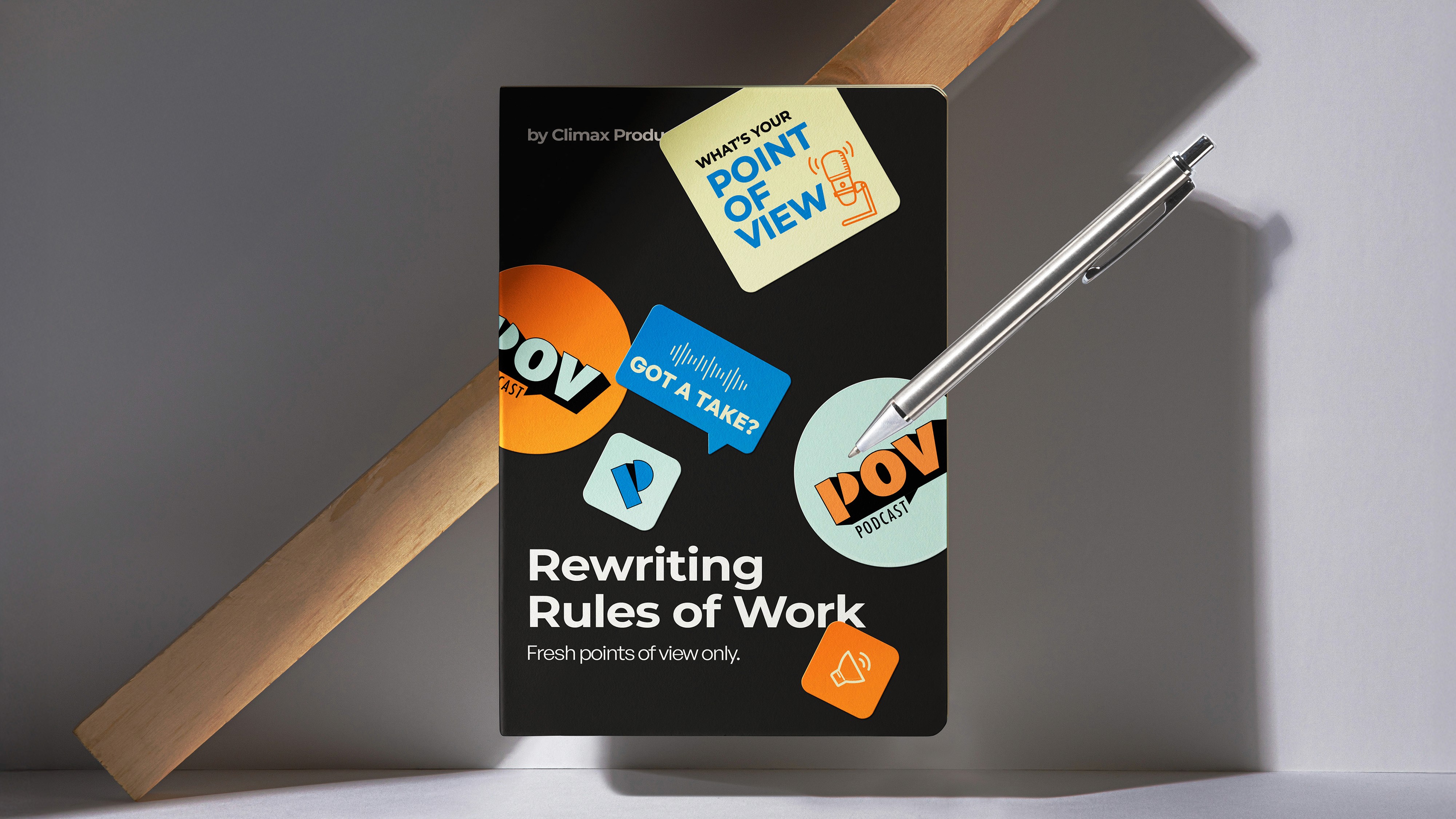
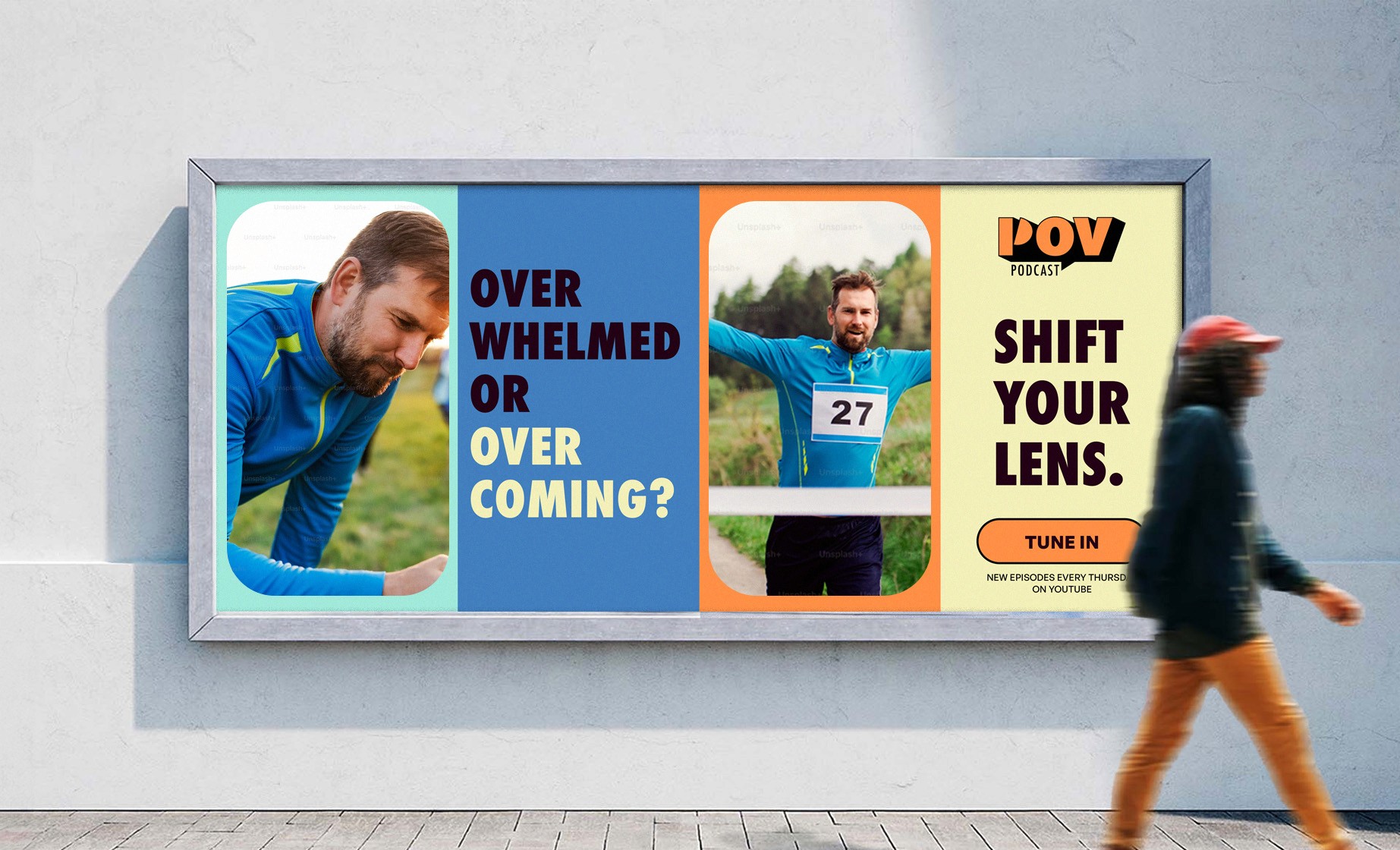
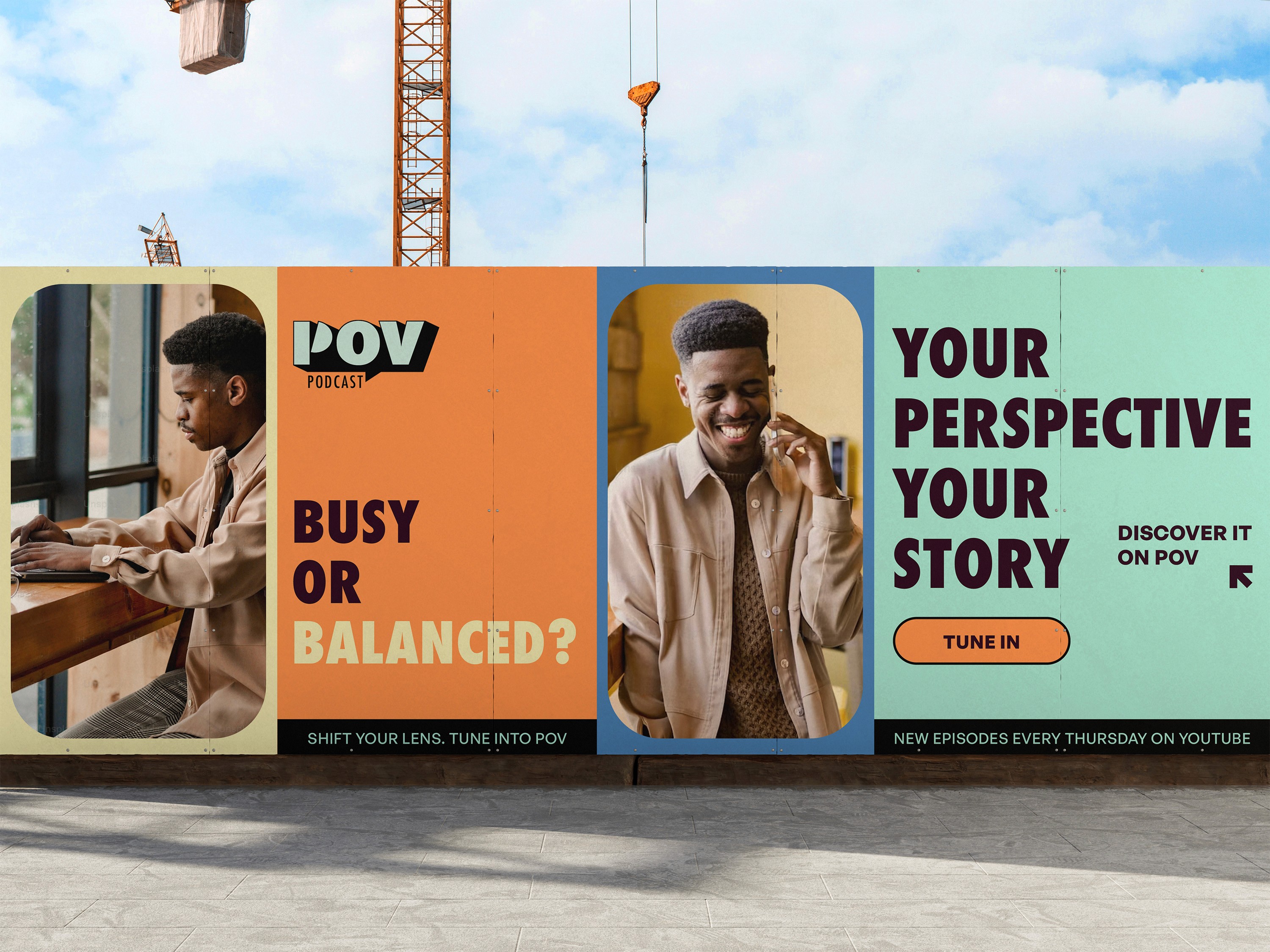
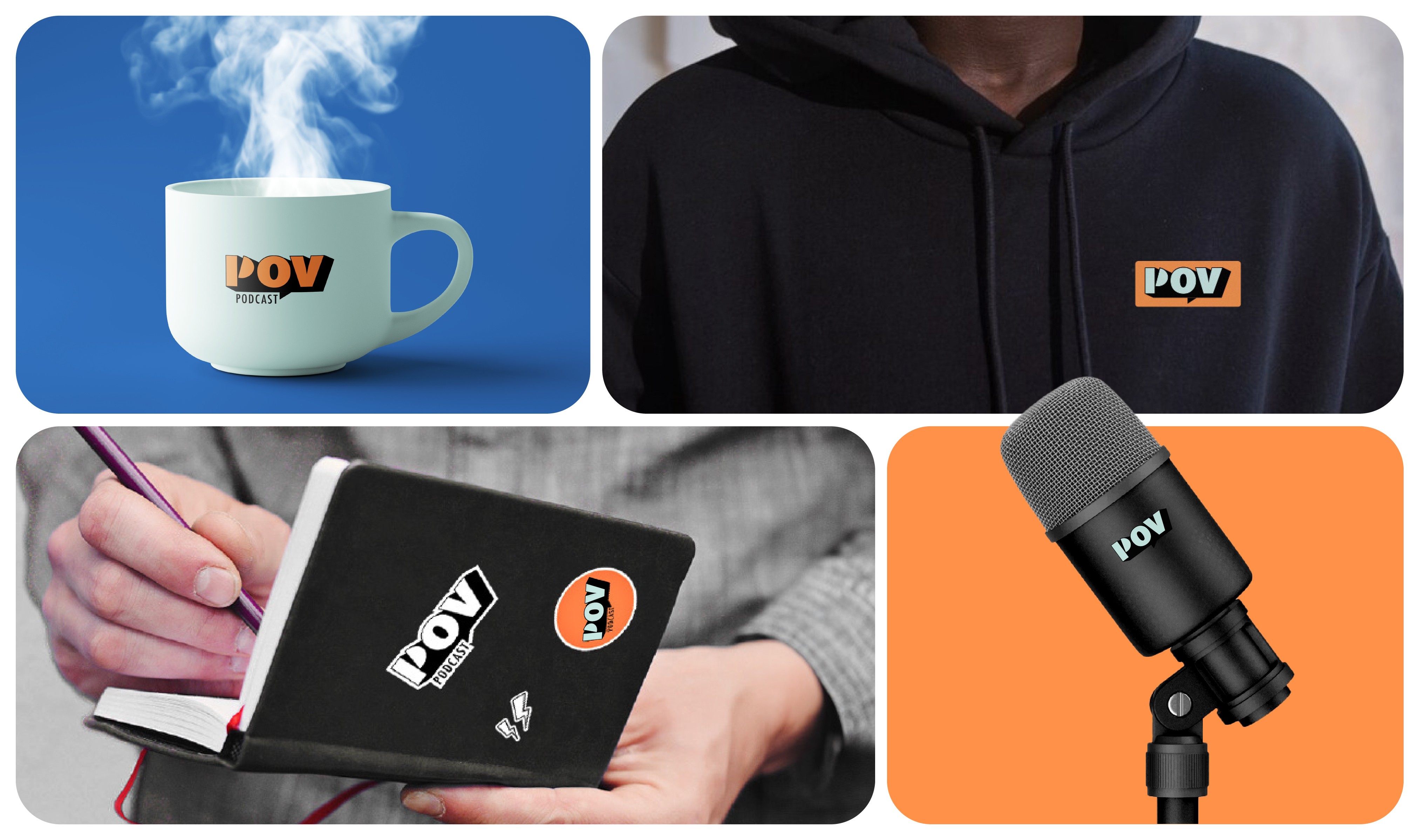
POV, also known as Point of View is a fresh podcast show in Egypt. A thought-provoking platform that redefines how Gen Z and Millennials navigate work and life. Through engaging, multi-perspective discussions, each episode unpacks a central theme, exploring unique topics and questions that keep the audience hooked.

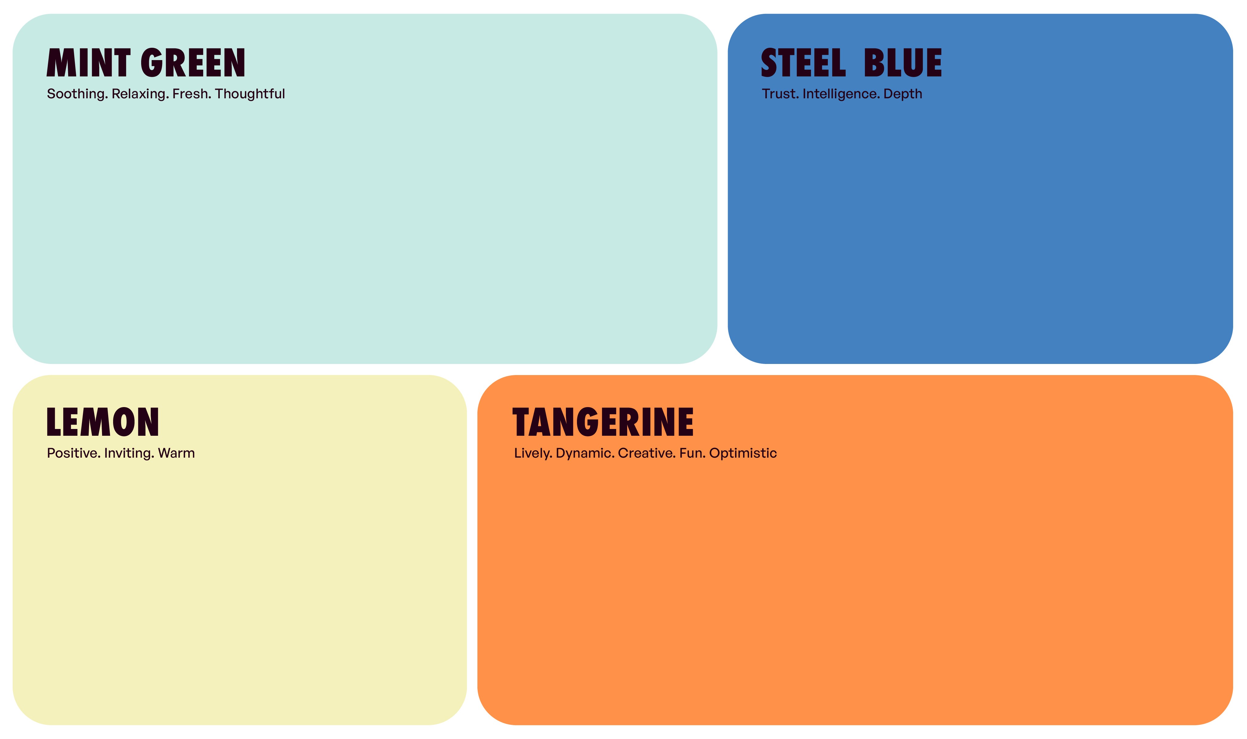
My role was to position their brand and design their visual identity. Beyond branding, I played an active role in promoting their podcast show on social media. The goal was to challenge conventional work narratives and provide listeners with diverse, insightful perspectives that resonate with their realities. The biggest challenge was striking the right balance, ensuring the brand persona & visual language felt fresh and exciting without losing the trust and relatability that makes POV a go-to source for work-life insights.

Shaping the Identity The POV logo is built around the core idea of conversation, perspective, and storytelling, aligning seamlessly with the podcast’s theme of exploring work-life from multiple viewpoints. The letter "P" is cleverly animated to mimic a talking mouth, symbolizing discussions, guest conversations and different points of view. The speech box subtly reinforces the idea of a discussion. Thinking Beyond a Logo Its bold and playful typography appeals to Gen Z & Millennials, making it dynamic and engaging. Designed for versatility, the logo seamlessly integrates into animated intros, social media, and merchandise, creating a strong, recognisable identity that positions POV as more than just a podcast - it’s a conversation starter.

Shaping the Identity The POV logo is built around the core idea of conversation, perspective, and storytelling, aligning seamlessly with the podcast’s theme of exploring work-life from multiple viewpoints. The letter "P" is cleverly animated to mimic a talking mouth, symbolizing discussions, guest conversations and different points of view. The speech box subtly reinforces the idea of a discussion. Thinking Beyond a Logo Its bold and playful typography appeals to Gen Z & Millennials, making it dynamic and engaging. Designed for versatility, the logo seamlessly integrates into animated intros, social media, and merchandise, creating a strong, recognisable identity that positions POV as more than just a podcast - it’s a conversation starter.

Shaping the Identity The POV logo is built around the core idea of conversation, perspective, and storytelling, aligning seamlessly with the podcast’s theme of exploring work-life from multiple viewpoints. The letter "P" is cleverly animated to mimic a talking mouth, symbolizing discussions, guest conversations and different points of view. The speech box subtly reinforces the idea of a discussion. Thinking Beyond a Logo Its bold and playful typography appeals to Gen Z & Millennials, making it dynamic and engaging. Designed for versatility, the logo seamlessly integrates into animated intros, social media, and merchandise, creating a strong, recognisable identity that positions POV as more than just a podcast - it’s a conversation starter.

Expanding the Visual Language The design language is bold yet approachable, ensuring our presence is strong while remaining inviting. The colour palette is fun, energetic, and trustworthy, reflecting our commitment to engaging yet meaningful conversations. The curves in our brand assets represent warmth and candidness, making the audience feel welcome. While the structured layouts and geometry in our typography reinforce professionalism and reliability, creating a perfect blend of authenticity and credibility.

Expanding the Visual Language The design language is bold yet approachable, ensuring our presence is strong while remaining inviting. The colour palette is fun, energetic, and trustworthy, reflecting our commitment to engaging yet meaningful conversations. The curves in our brand assets represent warmth and candidness, making the audience feel welcome. While the structured layouts and geometry in our typography reinforce professionalism and reliability, creating a perfect blend of authenticity and credibility.


Now That We Know What POV Stands For, How Do We Communicate It To Our Target Audience?


We launched a strategic campaign designed to shift perspectives, encouraging listeners to see work-life through a new lens - perfectly aligning with POV’s core message of diverse viewpoints.

By combining engaging visuals with thought-provoking copy, we created an eye-catching campaign that stops people in their tracks. This narrative-driven approach taps into relatable emotions, sparking curiosity, introspection, and engagement.

With bold typography, dynamic layouts, and a fresh color palette, the campaign grabs attention instantly, making people pause, reflect, and ultimately, tune in to shift their lens.