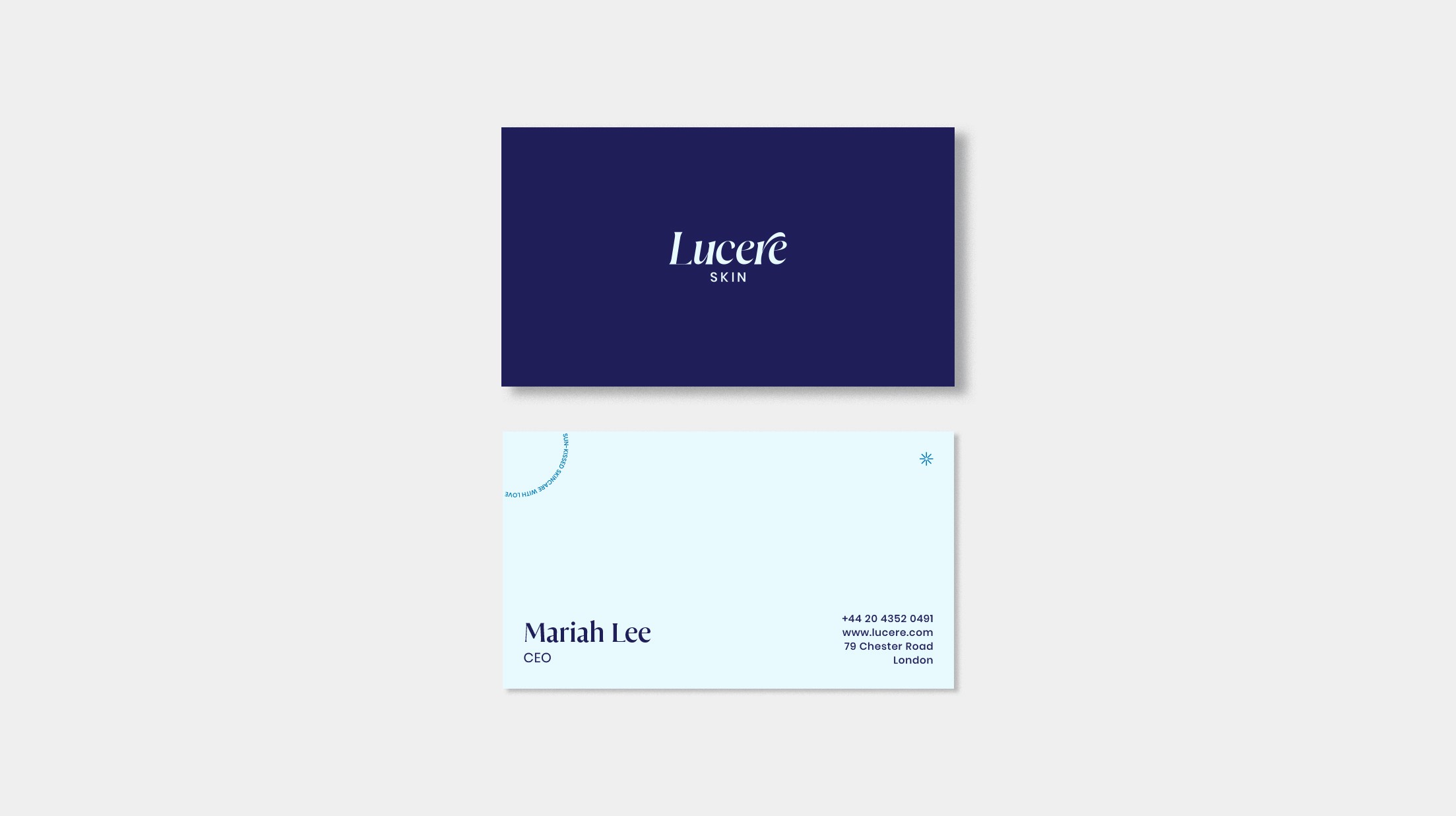
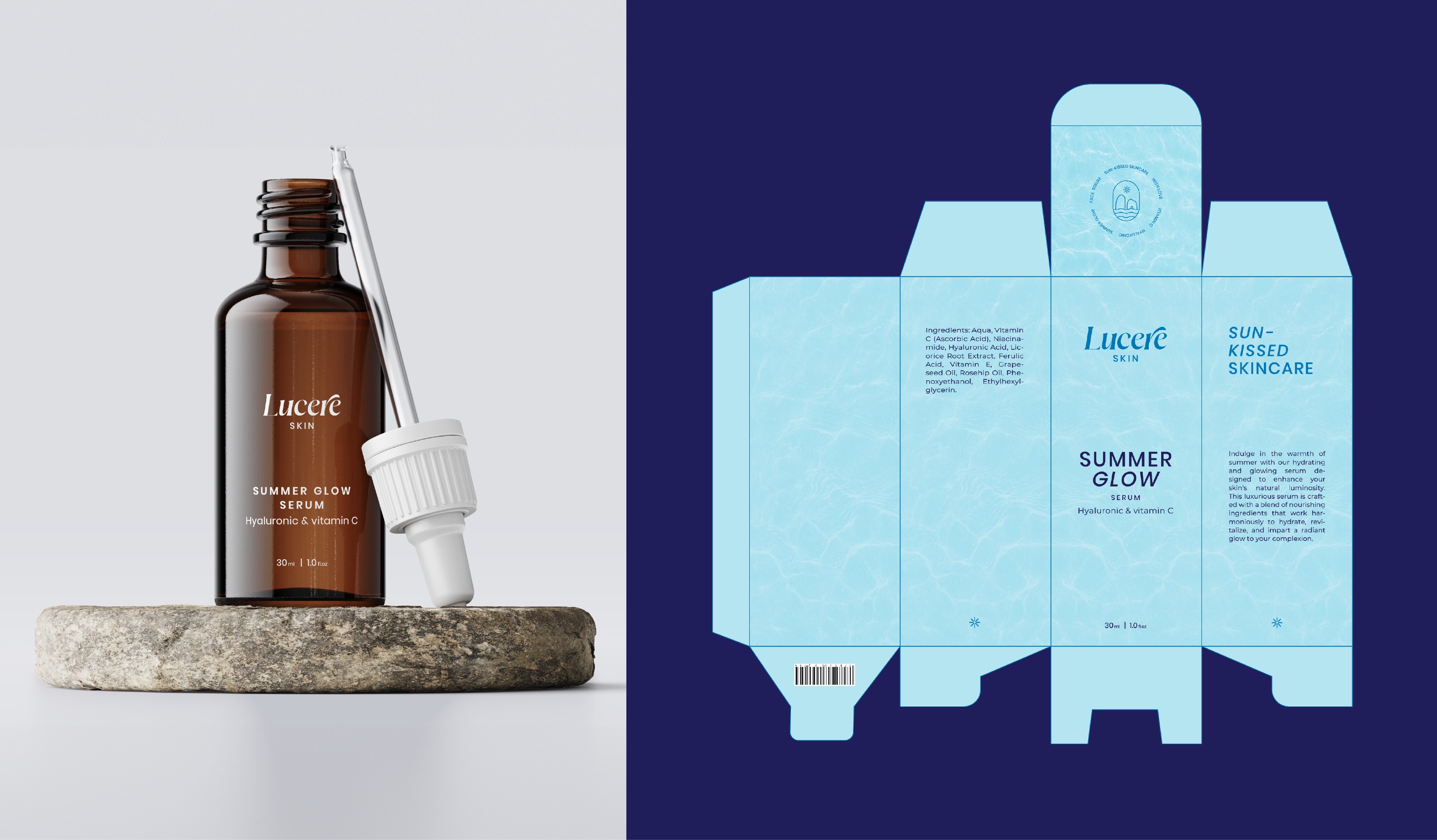
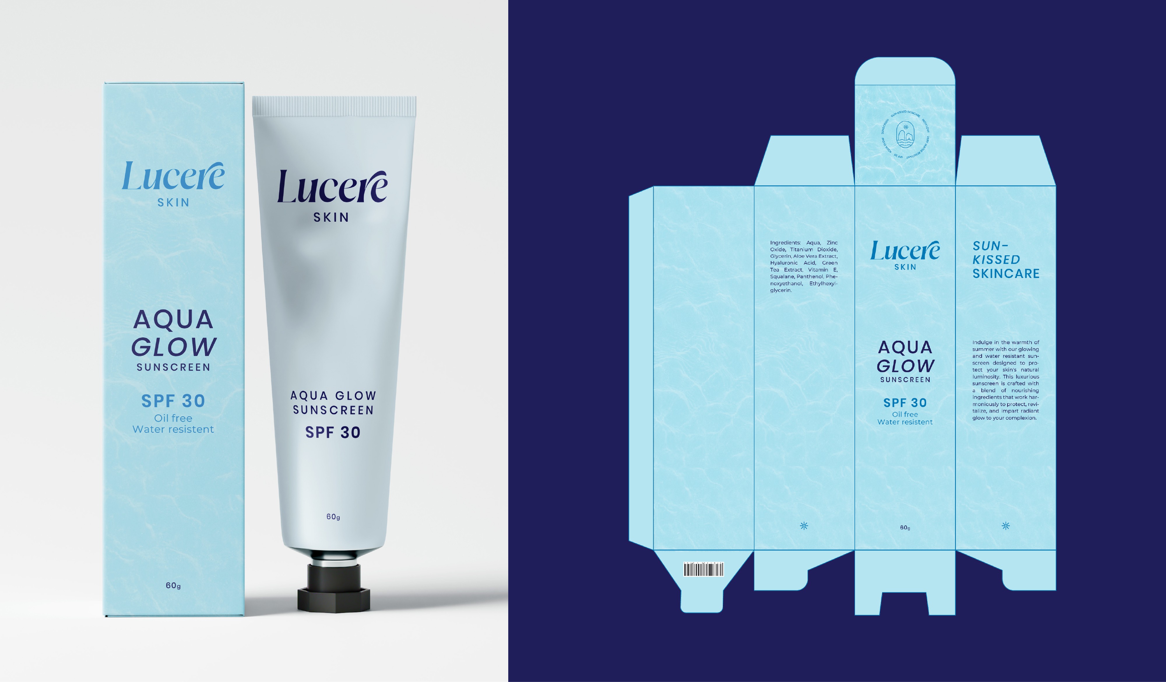
Lucere Skin

Lucere Skin

Designing transformative experiences for premium skincare

Designing transformative experiences for premium skincare

Branding

| Packaging

Packaging

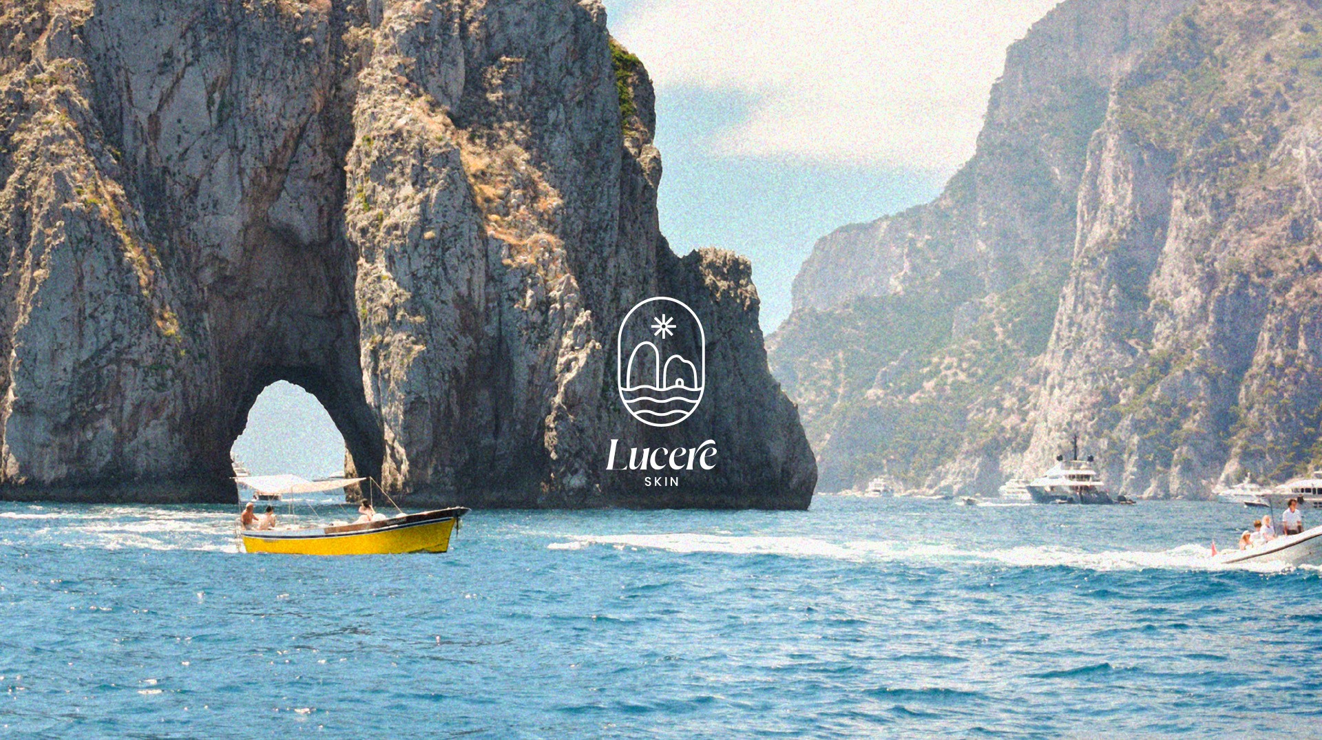
Basking in the warmth of a European summer every day

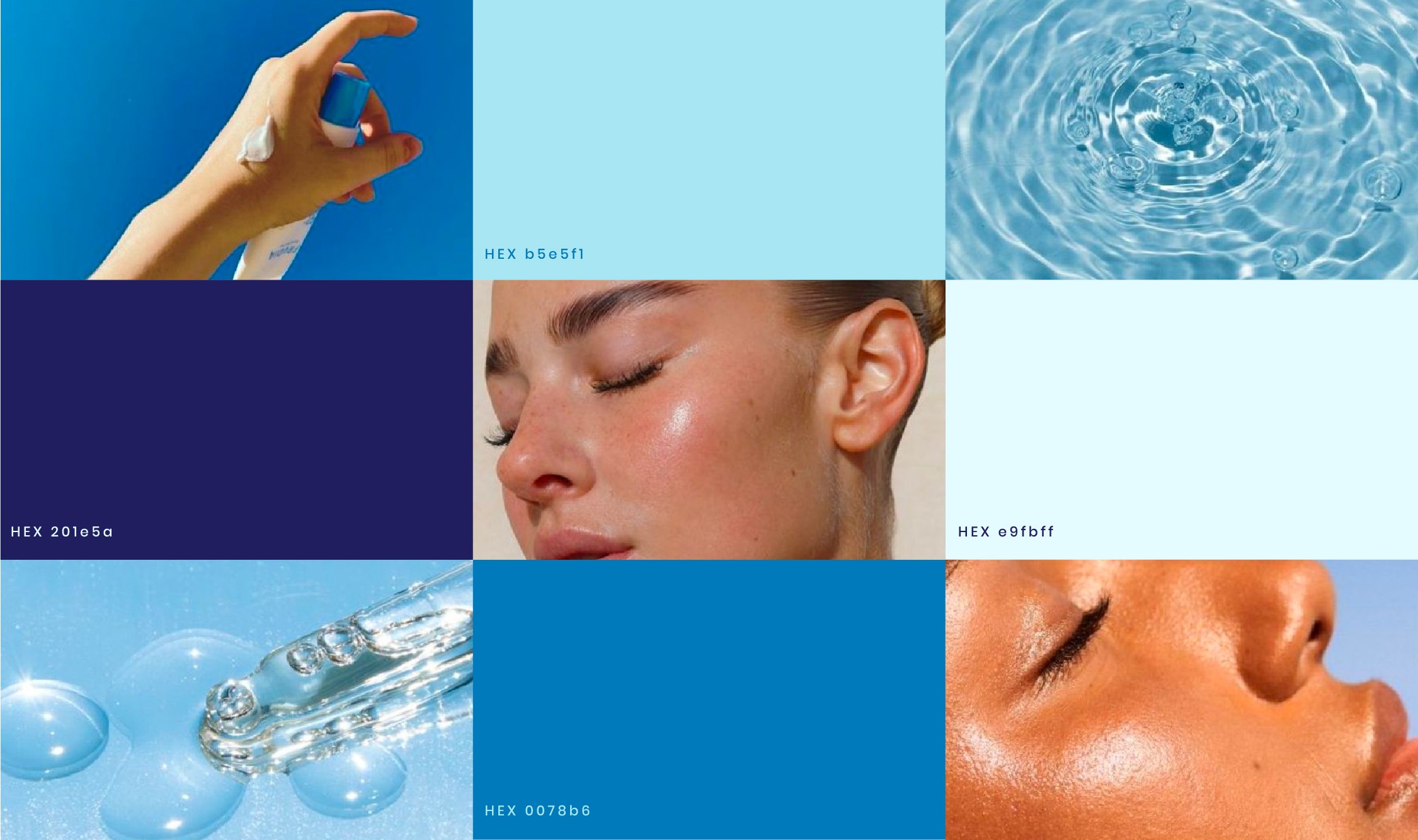
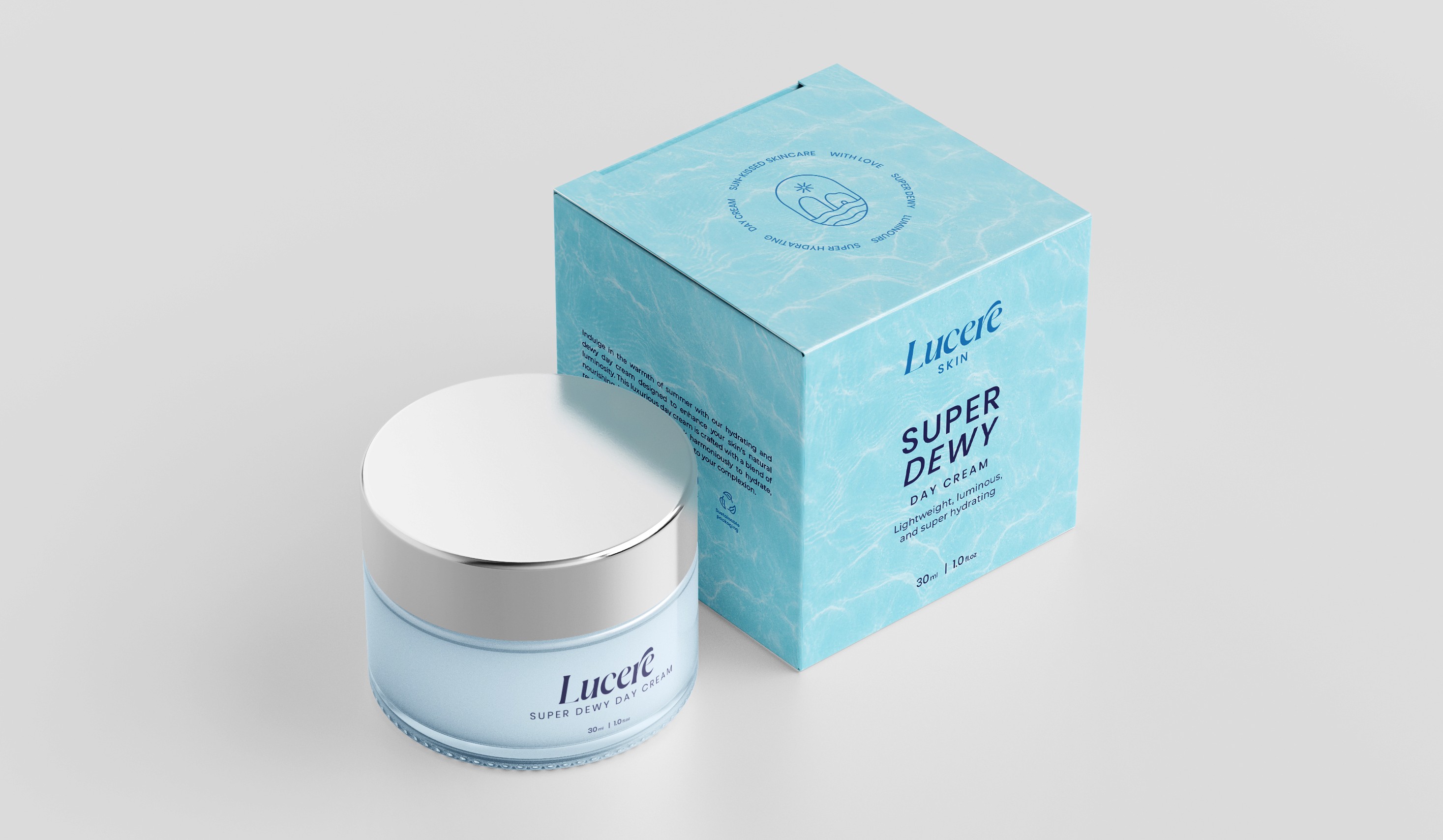
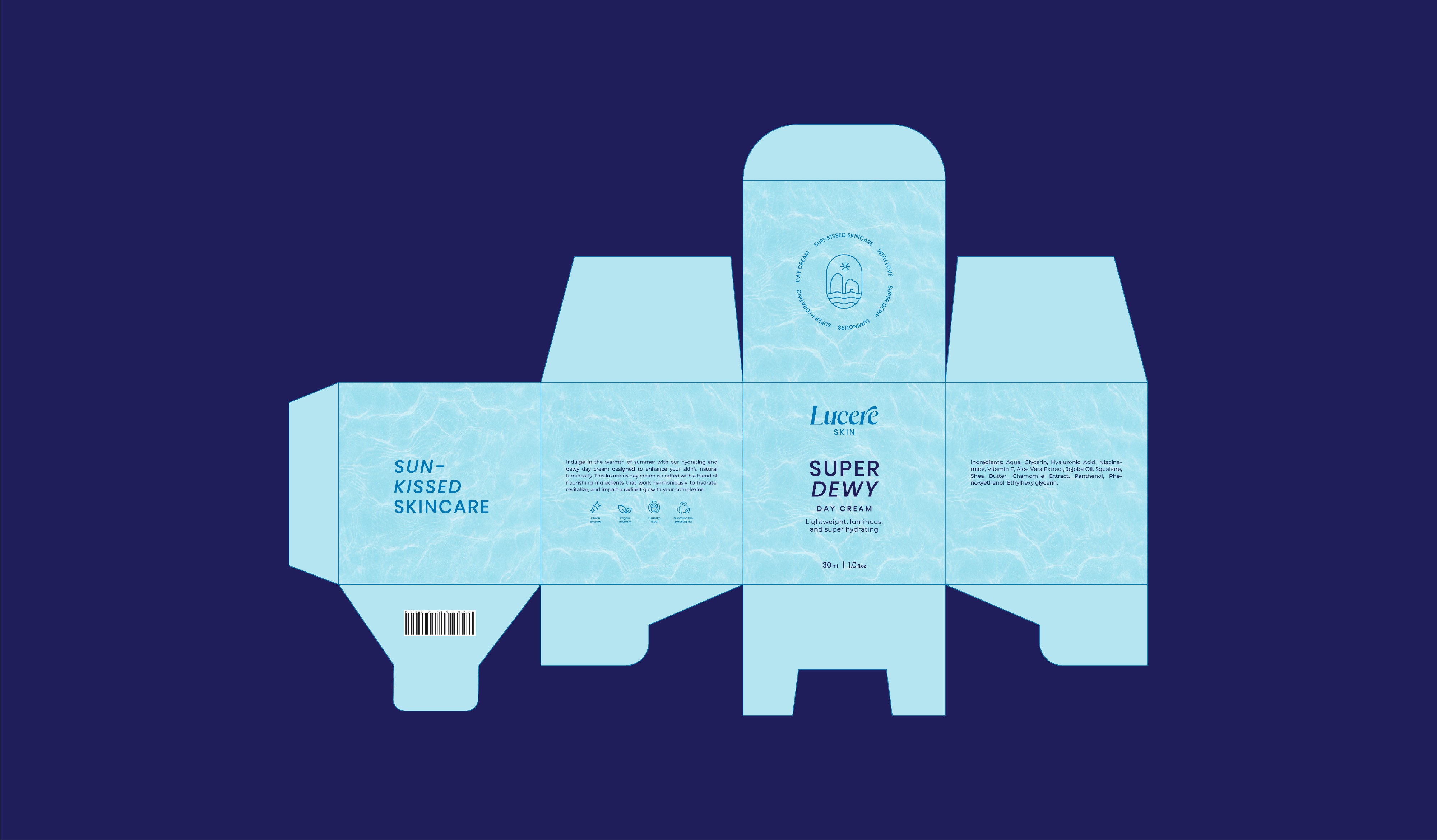
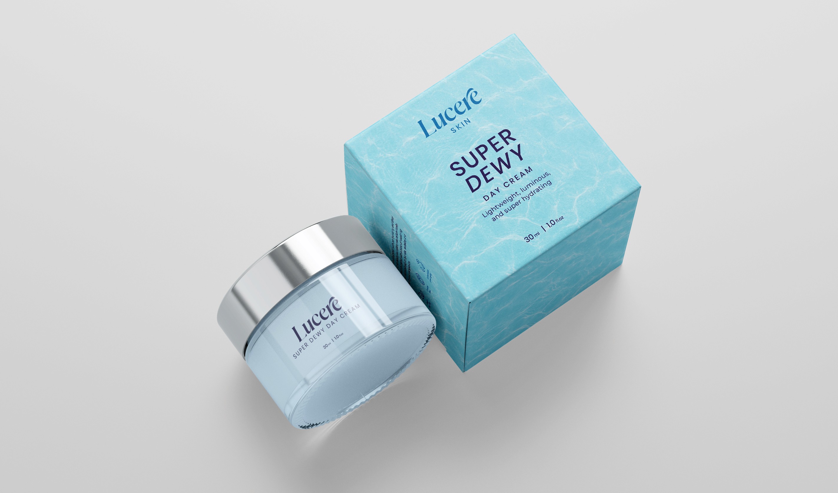
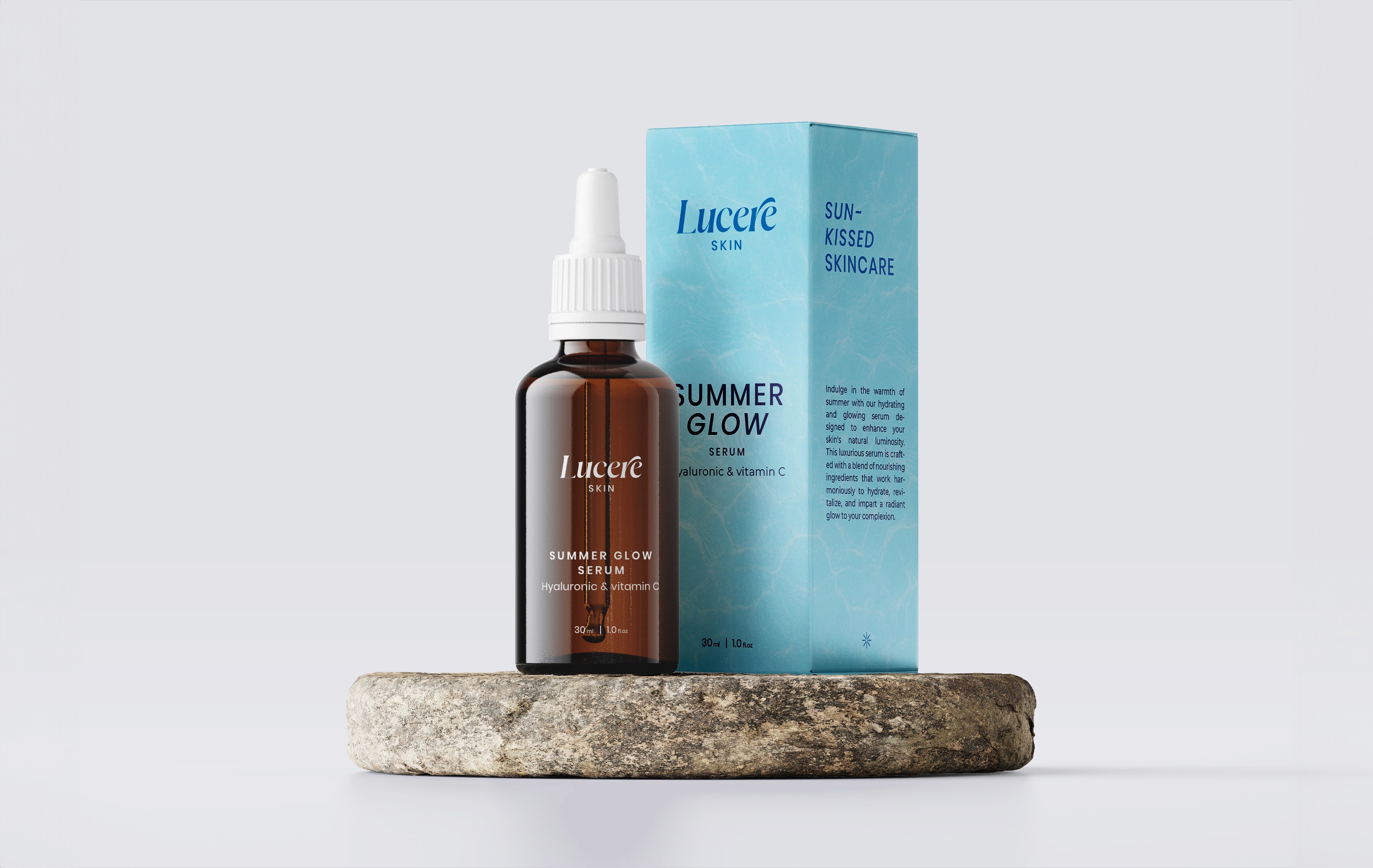
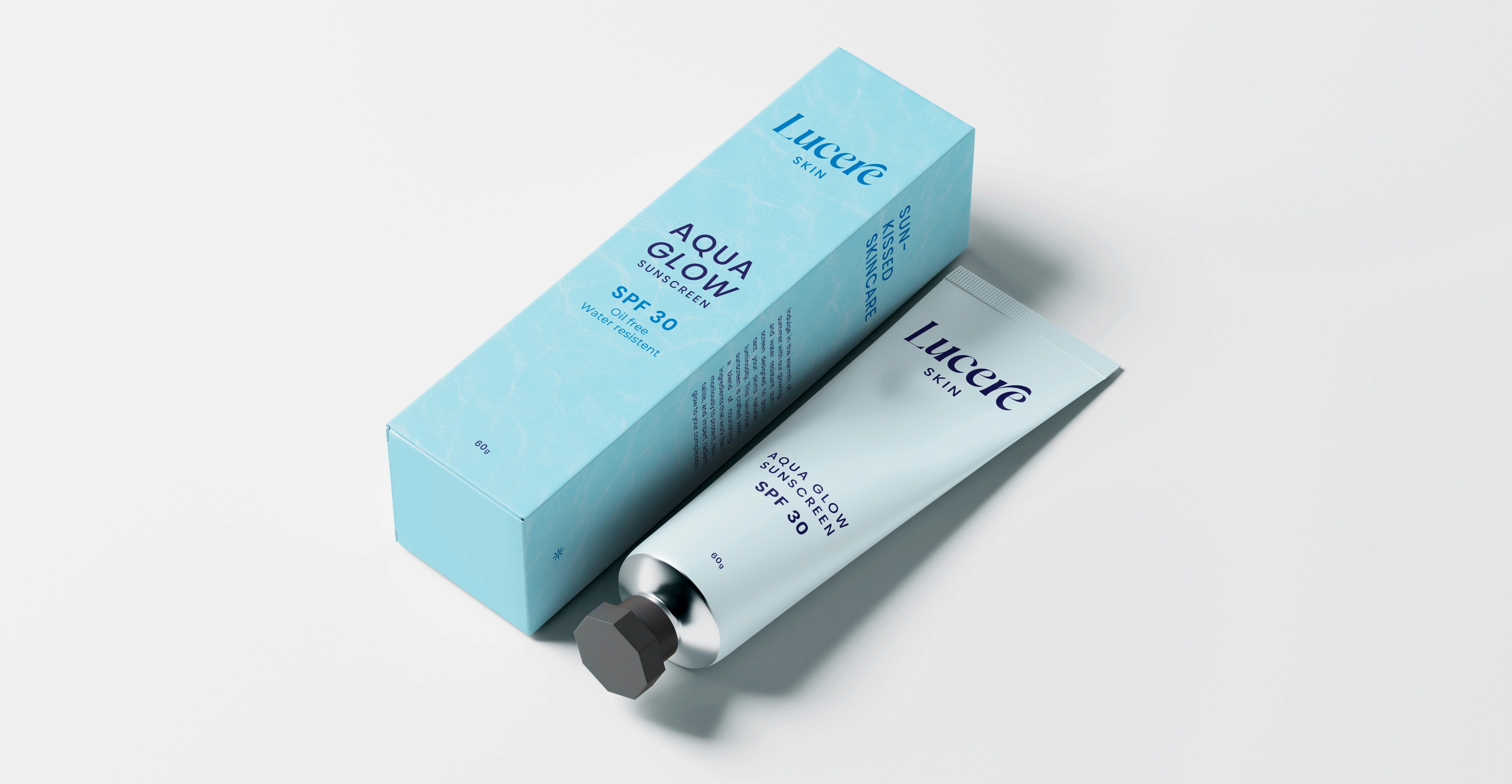
Lucere is a skincare brand that offers high-quality, multi-tasking formulas that cater to the need for effective skincare and the desire for a luxurious, sensory experience. The brand's products give users a naturally radiant, sun-kissed look while deeply nourishing and hydrating the skin. Each use transforms daily routines into blissful rituals, evoking the sensation of summer vibes and relaxation every day.

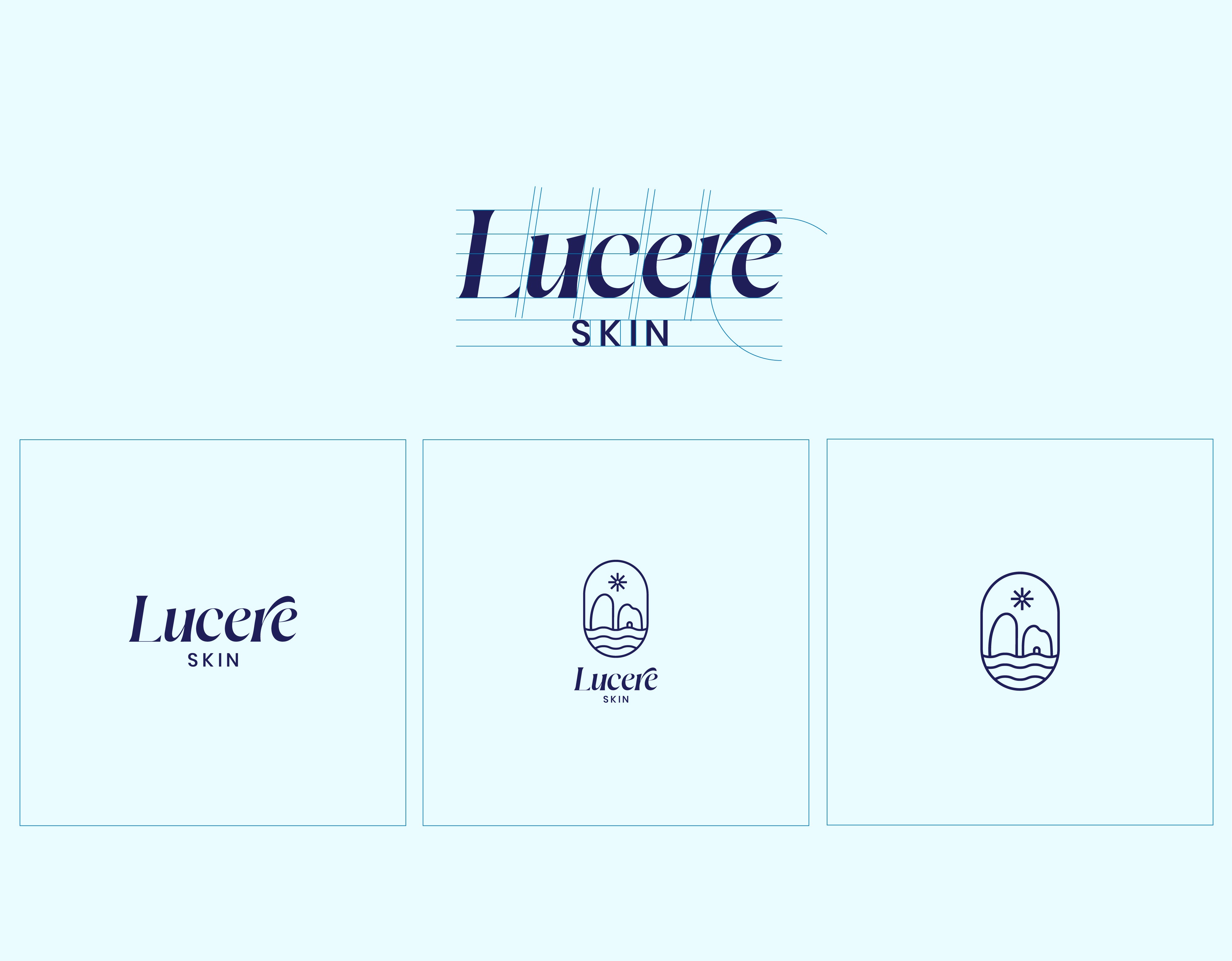
Being a newcomer, the brand found it challenging to make its mark in the already cluttered and dominating world of beauty. The client desired the products to deliver noticeable results as well as provide a luxurious experience that transports users to a state of relaxation and self-care. They approached me to design a visual identity and packaging that echoed their vision and set their brand apart from its competitors.

Lucere Skin embodies radiance, luxury, and sophistication. The typeface FT Total seamlessly blends elegant serifs with a modern touch, reflecting the brand’s refined aesthetic. The subtle curves in the type complement the brand story, while the arch in the 'R' draws inspiration from the Arc of Love, reinforcing themes of care and beauty. To enhance brand recall, I designed a secondary emblem that supports the logotype, adding versatility and a distinctive visual identity.

Lucere Skin embodies radiance, luxury, and sophistication. The typeface FT Total seamlessly blends elegant serifs with a modern touch, reflecting the brand’s refined aesthetic. The subtle curves in the type complement the brand story, while the arch in the 'R' draws inspiration from the Arc of Love, reinforcing themes of care and beauty. To enhance brand recall, I designed a secondary emblem that supports the logotype, adding versatility and a distinctive visual identity.

Lucere Skin embodies radiance, luxury, and sophistication. The typeface FT Total seamlessly blends elegant serifs with a modern touch, reflecting the brand’s refined aesthetic. The subtle curves in the type complement the brand story, while the arch in the 'R' draws inspiration from the Arc of Love, reinforcing themes of care and beauty. To enhance brand recall, I designed a secondary emblem that supports the logotype, adding versatility and a distinctive visual identity.

The outer packaging features a textured finish that mimics the curves and waves of the waters of Capri, creating a tactile and immersive experience. In contrast, the actual products embrace a minimalist aesthetic, letting the refined typography shine.

The outer packaging features a textured finish that mimics the curves and waves of the waters of Capri, creating a tactile and immersive experience. In contrast, the actual products embrace a minimalist aesthetic, letting the refined typography shine.